
Mexico in Color: Capturing Vibrant Streets Without Losing Their Stories

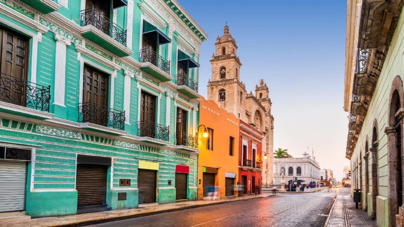
Colorful colonial architecture and historic facades in Mexican streetscapes reveal layers of civic history and daily community life.
Color is often one of the first things a photographer notices in Mexico. A cobalt doorway interrupts a weathered wall. Strings of papel picado move above a street. Fruit is stacked in bands of green, orange, yellow, and red beneath a market canopy. Murals stretch across entire buildings, while hand-painted signs give even the smallest storefront a distinct personality. It is easy to understand why visiting photographers are drawn to these scenes. Color seems to offer an immediate path to an exciting image.
Yet color can also become a shortcut. If every wall is treated as a backdrop and every market as a collection of bright objects, the resulting photographs may be visually attractive while saying very little about the places they depict. The challenge is not simply to capture Mexico’s vibrant streets. It is to understand what the color belongs to, how people interact with it, and why a particular scene deserves attention beyond its palette.
| Subject Setting | Common Photographic Pitfall | Authentic Photographic Approach |
|---|---|---|
| Painted Facades & Doorways | Treating buildings merely as 2D pastel backdrops | Look for patina, architectural layering, weathered signs, and active human engagement |
| Bustling Traditional Markets | Overcrowded frames and treating merchants as performers | Focus on visual relationships, textures, and repeating patterns; ask permission before portraits |
| Public Murals & Street Art | Copying the wall flatly without neighborhood scale | Step back to incorporate pedestrians, street life, structural wear, and local artist attribution |
| Ceremonies & Festivals | Intrusive shooting during private spiritual moments | Observe first, research cultural roots, respect boundaries, and know when to lower the camera |
| Post-Processing & Color Grading | Oversaturating warm tones and skewing human skin tones | Maintain realistic exposure and white balance; preserve natural skin pigments and textures |
Beyond the Surface: Looking at Context Before Framing
A thoughtful color photograph begins with context. Before framing a painted doorway, look at the building around it. Is it part of a home, a workshop, a restaurant, or a public building? Has the paint been carefully maintained, or do several older colors show through the worn surface? Those details can turn a picture of “a blue door” into an image about use, time, and the changing identity of a street.
The same principle applies to larger scenes. A row of colorful façades may initially appear to be a simple exercise in symmetry, but the life taking place in front of them can add meaning. A vendor arranges goods beneath an awning. Neighbors talk from opposite sides of a narrow street. A child waits beside an adult near a bus stop. These elements are more than accessories placed in front of an attractive background. They are part of the reason the street looks and feels the way it does.
Simplifying Compositions: The Power of Negative Space and Focal Color
Start by asking what attracted you to the scene. Was it one dominant color, a contrast between two colors, or a repeating pattern that led your eye through the frame? Identifying that relationship can help you simplify the composition. If the strongest element is a yellow wall against a blue sky, a bright red vehicle at the edge of the frame may become an unnecessary distraction. Moving a step to the side or waiting a few seconds can preserve the color story you actually want to tell.
Strong color does not require filling every inch of the photograph. A small area of intense color surrounded by neutral space can be more powerful than a frame containing every shade available. A red chair in a pale courtyard, a green plant against stone, or a bright piece of fabric in a shadowed market aisle can give the eye a clear place to rest. Color works best when it has a role within the composition rather than appearing as decoration scattered across it.
The Quality of Light: Working Beyond Golden Hour Tropes
Light determines how those colors will be recorded. Early morning and late afternoon often produce warm illumination, but warm light is not automatically flattering to every subject. It may shift a cool blue wall toward purple or make a neutral surface appear more golden than it really is. Midday sun can create harsh contrast, yet it may also produce crisp geometric shadows that suit bold architecture. Overcast skies can soften a scene and reveal subtle differences in paint, stone, fabric, and foliage.
Instead of searching only for the supposedly perfect hour, learn what each kind of light makes possible. Side light can bring out the texture of a peeling wall. Open shade can preserve the range of colors in a market display. Reflected light from a bright building may gently illuminate a person standing nearby. When the sun is intense, exposing for the highlights can turn dark doorways and awnings into graphic shapes that give structure to the frame.
Navigating Marketplaces: Capturing Visual Rhythms Respectfully
Markets are especially rich environments for color photography because they combine objects, people, movement, and changing light. They can also overwhelm the camera. Produce, packaging, signs, clothing, containers, and decorations may all compete for attention. Take a moment to observe before trying to photograph everything at once.
Look for smaller visual relationships within the larger market. Perhaps a vendor’s apron repeats the color of the fruit on the counter, or several baskets form a pattern that leads toward a person working in the background. A single beam of light may illuminate one section of an otherwise dim aisle. These relationships provide a reason for the color to be present in the photograph.
Vary the distance from which you work. A wide frame can show how color organizes the entire space, while a closer photograph can reveal textures and careful arrangements. A detail might focus on handwritten labels, the surface of pottery, or the layers of ingredients used to prepare food. When these images are viewed together, they create a more complete narrative than a series of close-ups chosen only because they are bright.
Remember that markets are working environments. Do not block customers, rearrange merchandise without permission, or treat vendors as performers. If you want to make a close portrait or photograph someone at work, ask first. Buying something or beginning with a friendly conversation can establish a more natural interaction, but a purchase does not automatically entitle you to a photograph. Respect the answer you receive.
Documenting Murals: Honoring Artists and Community Context
Murals create another temptation to let color do all the work. Their scale and detail can produce an impressive image with little effort, but simply copying the entire wall rarely communicates how the artwork exists within its community. Step back and look at what surrounds it. Does the mural face a playground, a shop, an empty lot, or a busy intersection? Do pedestrians stop to look at it, or has it become such a familiar part of the neighborhood that people pass without noticing?
Including those relationships can make the photograph more informative. A person crossing in front of the mural may provide scale. A nearby doorway may show how the artwork follows the building’s architecture. Weathering, repairs, posters, and graffiti may reveal how the wall has changed since the original image was painted. Rather than hiding every imperfection, decide whether those marks are part of the mural’s continuing story.
Whenever possible, record the artist’s name and learn something about the subject. A mural may honor a local figure, memorialize an event, express a political position, or celebrate a community tradition. Its meaning may be more specific than a visitor can understand at first glance. Accurate captions and attribution help prevent a meaningful work from being reduced to a generic “colorful Mexican wall.”
Photographing Faith, Festivals, and Cultural Celebrations
Color also appears in religious and cultural spaces, where extra care may be necessary. Decorations, flowers, clothing, candles, and ceremonial objects can be visually compelling, but their significance extends beyond their appearance. Observe before photographing, follow posted rules, and ask when you are uncertain. During a ceremony or private act of devotion, putting the camera down may be the most respectful choice.
Festivals present similar challenges. They can fill the streets with movement, costumes, banners, food, and music, creating countless photographic opportunities. However, a festival is not merely a public performance for outsiders. Learn what is being celebrated, who is participating, and whether particular moments have spiritual, historical, or communal importance. That understanding will help you recognize which images contribute to the story and which may misrepresent it.
Finding Poetry in Everyday Routines and Modern Mexican Life
Everyday scenes can be just as rewarding as major events. Painted taxis waiting in a row, laundry drying above a courtyard, plastic chairs arranged outside a business, and delivery crates stacked beside a doorway all use color in ways that reveal daily routines. These subjects may appear modest, but they often provide a more intimate sense of place than a dramatic spectacle.
People do not need to wear traditional clothing or stand in front of old architecture for a photograph to feel connected to Mexico. Contemporary fashion, modern storefronts, public transportation, office districts, and new construction belong to the visual story as much as historic buildings and handmade goods. Including them prevents a travel collection from suggesting that the country exists primarily in an idealized past.
This is especially important when editing a series. If every photograph favors weathered walls, vintage vehicles, and traditional objects while excluding ordinary signs of modern life, the collection may reinforce a narrow impression that was created by the photographer rather than discovered on the street. A richer sequence allows old and new, quiet and busy, polished and worn to share the frame.
Color Editing Restraint: Protecting Textures and Natural Skin Tones
Color editing requires similar restraint. Increasing saturation can make an image feel impressive for a few seconds, but excessive adjustments may erase the differences between materials, distort skin tones, and turn natural light into something artificial. Begin by correcting exposure and white balance. Then compare the edited photograph with your memory of the scene. The goal does not have to be perfect scientific accuracy, but the image should retain a believable relationship to what you witnessed.
Pay particular attention to reds, oranges, and magentas, which can lose detail quickly when saturation is pushed too far. Blues in shaded areas can also become unnaturally intense. Use selective adjustments when one part of the frame needs attention rather than applying the same increase to every color. Sometimes reducing saturation in a distracting area makes the important color appear stronger without altering it at all.
Skin tones deserve special care. A global adjustment that makes a wall more vivid may also make a person’s face look unnatural. If people are central to the image, edit with them in mind first. A colorful setting should support the human subject rather than overwhelm or visually transform them.
Creating Intentional Stock and Editorial Travel Photography
If you are creating stock photos during your travels, think about how color and context will help a future viewer understand the image. A clean composition with room for text can be useful for design projects, while a more layered editorial photograph may illustrate a story about neighborhood life, tourism, food, architecture, or public art. Capture both horizontal and vertical variations when the situation allows, but avoid repeating the same image so mechanically that you stop observing what is happening.
Keep accurate notes about locations, events, artworks, and any permissions you receive. Recognizable people may require releases for certain commercial uses, while murals, trademarks, private interiors, and protected properties can introduce additional considerations. Photographing something from a public place does not necessarily give a photographer unlimited rights to license its image. Understanding the intended use is part of creating responsible and useful photography.
Captions should describe what is known rather than filling gaps with guesses. If you do not know the meaning of an object or tradition, research it or keep the wording factual and limited. A caption can identify the city, setting, activity, and visible details without making broad claims about Mexican culture. Accuracy makes the photograph more valuable and treats its subjects with greater respect.
Assembling a Balanced Travel Photography Portfolio
When assembling your final collection, look for visual and emotional variety. A bright market scene might be followed by a quiet blue doorway in shade. A wide photograph of a mural could sit beside a close detail of paint meeting cracked plaster. A lively street corner may be balanced by an empty plaza just after sunrise. These changes in scale and pace keep color from becoming repetitive.
You may also find that the strongest photograph is not the most colorful one. A muted scene can provide context, create a pause, or reveal a part of the story that vivid images miss. Color should guide your attention, not control every decision. When you allow quieter frames into the sequence, the bright ones often become more effective.
Photographing Mexico in color is ultimately an exercise in looking past the surface without ignoring its beauty. The painted walls, market displays, murals, flowers, signs, and fabrics are worth celebrating, but they are connected to people, work, memory, commerce, art, and community. Their stories do not sit behind the color as something separate. They are carried within it.
Approach each street with enough patience to discover those connections. Learn what you can, ask when appropriate, and allow the scene to be more complicated than the picture you first imagined. You will still return with vibrant photographs, but the color will have a purpose. It will lead viewers toward the life of the place rather than stopping them at its surface.
Related Travel Guides
Oaxaca Barranca Larga Ventanilla Highway and Puerto Escondido Tourism Guide 2026
Mexico Beach Tourism Slowdown and Coastal Travel Trends 2026
Mexico Colonial Cities Street Photography and Cultural Guide 2027
This article is for informational purposes. Flight routes, passenger regulations, visa rules, and transit advisories are subject to change by airlines and aviation authorities. Readers are advised to verify schedules and travel documentation with relevant carriers and border agencies before departure.
Related Stories
13 Best Cities for Photographers in 2026: London, Paris, Rome & Dubai for Epic Urban Shots
Coworking Spaces and Remote Work Infrastructure in Mexico
